Westerdokseiland / housing
Amsterdam
Westerdokseiland / housing
Amsterdam
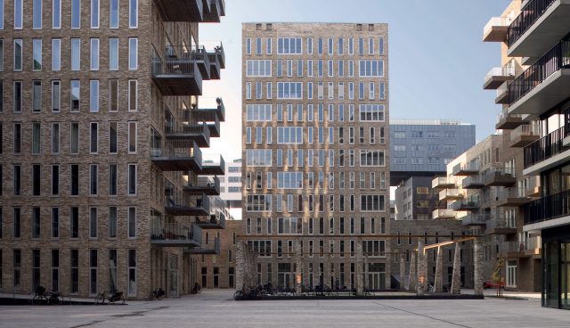
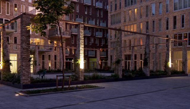
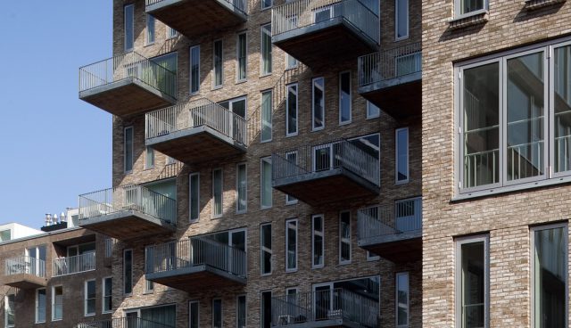
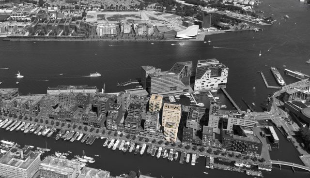
The section of the middle block, designed by OZ, consists of its own two sections: three high-rise buildings and a number of single-family dwellings. The architecture of Westerdok is simple and crisp in shape. The buildings are dominated by three materials: light-coloured rustic brick, aluminium frames and glass. The vertical windows provide the façade with a rhythm interrupted by the large horizontal windows for a panoramic view of the city. The austere façade is also refined by large projecting balconies substantial enough for a large table and chairs. In short, the exterior of the buildings is determined by contrasts: simple versus rustic, vertical versus panorama, etc. Inside, the buildings offer a wide range of housing types: large and small, owner-occupied and rented homes.
Yet despite these differences, all the homes are based on the same starting point. The layout of the floor plans of Westerdok is simple enough to provide a maximum of flexibility. Without the interruption of bathrooms and lavatories, the rooms are located next to one another so that they can later be merged to create a larger open space (or divided up to create smaller rooms). Located on the ground floor are the collective spaces for accommodating WIBO homes (homes located in historic surroundings that are protected by law from being used for any other purpose), commercial spaces and Steunpunt Zorg voor Welzijn (an organisation serving the needs of family caregivers).


