Urban Transformation
OZ Urbanism
Urban Transformation
OZ Urbanism
Our urban development projects focus on generating social and economic opportunities. The urban environment is improving and there is a greater interaction between living, learning, working and recreation. Our urban developers work on strategic visions, spatial transformations, urban restructuring, city centre plans, site division, and participation trajectory.
To improve urban environments, we are constantly innovating. Our solutions represent social cohesion and sustainability. Think of shared space, healthy urban living, integrated mobility solutions and a cyclical life span for buildings replacing demolition.
Our step-by-step plan to successful transformation entails: we exploring the location and context, we enter into discussions with stakeholders and advisers then create an urban master plan, design, or vision to get started. We work both independently, as well as but often also together with other design agencies or consultants, such as landscape architects.
Our designs are always in balance: between what is possible spatially on the one hand, and on the other, appropriate to the needs of our client.
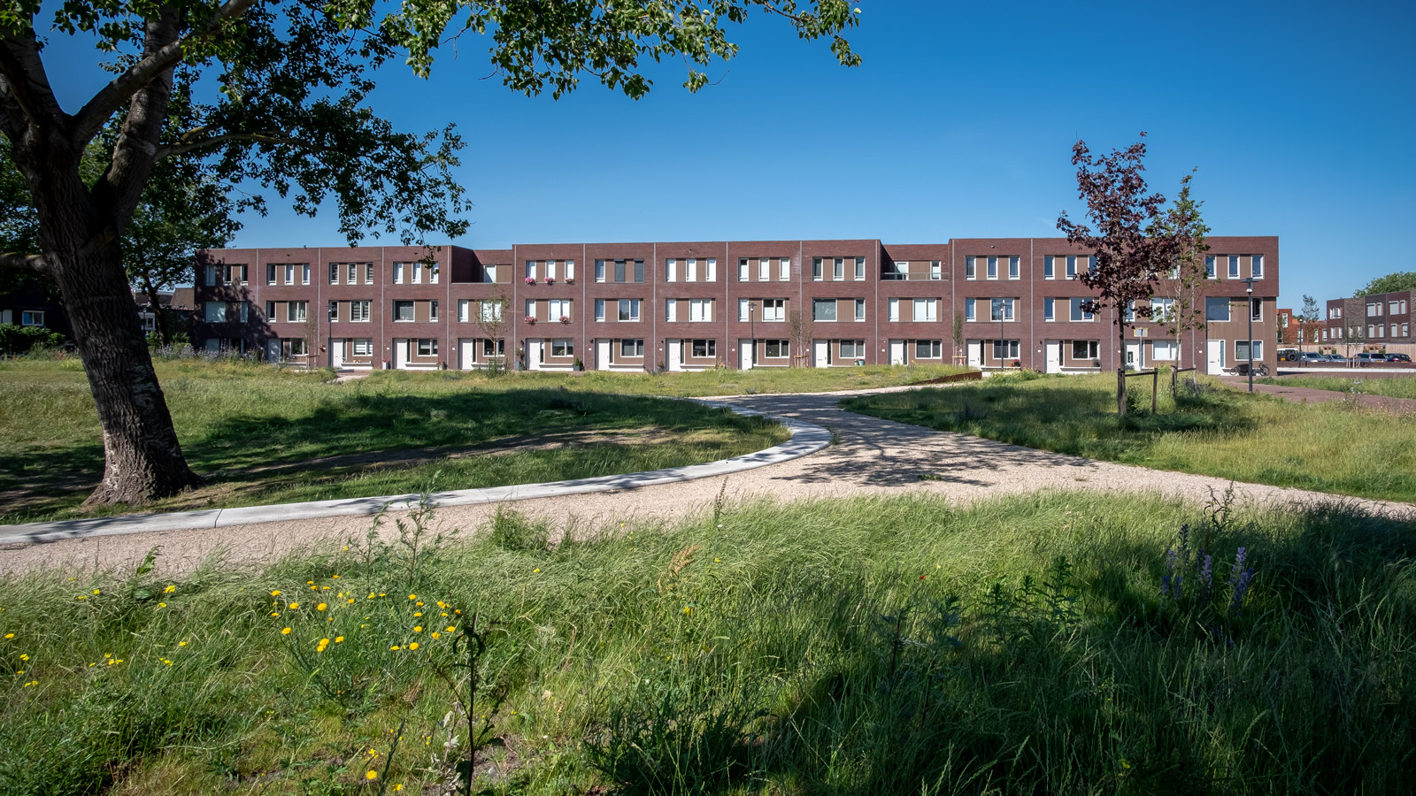
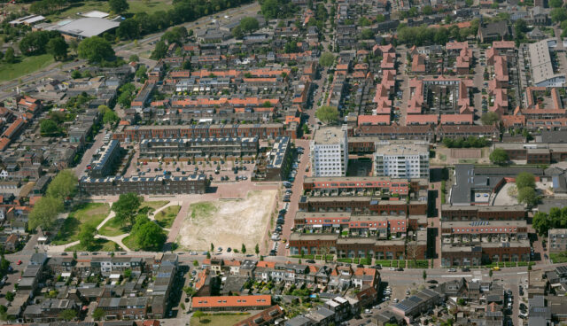
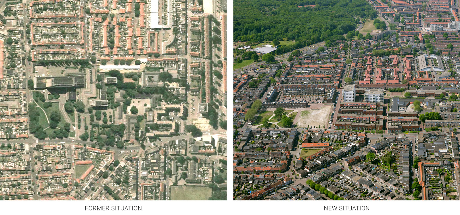
BINNENHAVEN IJMUIDENInitially, the transformation of the former Kennemer Gasthuisterrein, in the city of IJmuiden, was meant for families as well as elderly homes in one location. The family homes, regular apartments, and parking garage were built in the Binnenhaven. It consisted of 130 houses on the ground floor and 70 apartments. The elderly homes are on hold as a result of revised care policy. The phased construction made it possible to make a conscious, new choice for possibly more and different types of care homes. The location is the former Kennemer Gasthuisterrein in IJmuiden that was home to the Zeeweg hospital, which was demolished in 2008. The project area is located south of the centre of IJmuiden and is enclosed by the Zeeweg, Velser Duinweg and Appelboomstraat. The Zeeweg Hospital was demolished because hospital care could be provided elsewhere. The hospital could not be reused, resulting in the inner-city redevelopment of the hospital site. The aim of the developer Synchroon and the elderly care organization Zorgbalans was to redevelop the site with a large volume of homes and care apartments, a care centre, parking lot and a redeveloped layout of the public area. The main issues were:
OZ provided the urban development plan for the Binnenhaven. The designs for the houses were ultimately worked out by the architectural firms M3H Architecten Amsterdam and Faro Architecten Lisserbroek. Buro Lubbers Vught designed the public space. OZ’s urban development solution was based on three pillars:
client: Synchroon Ontwikkelaars in cooperation with ZorgBalans |
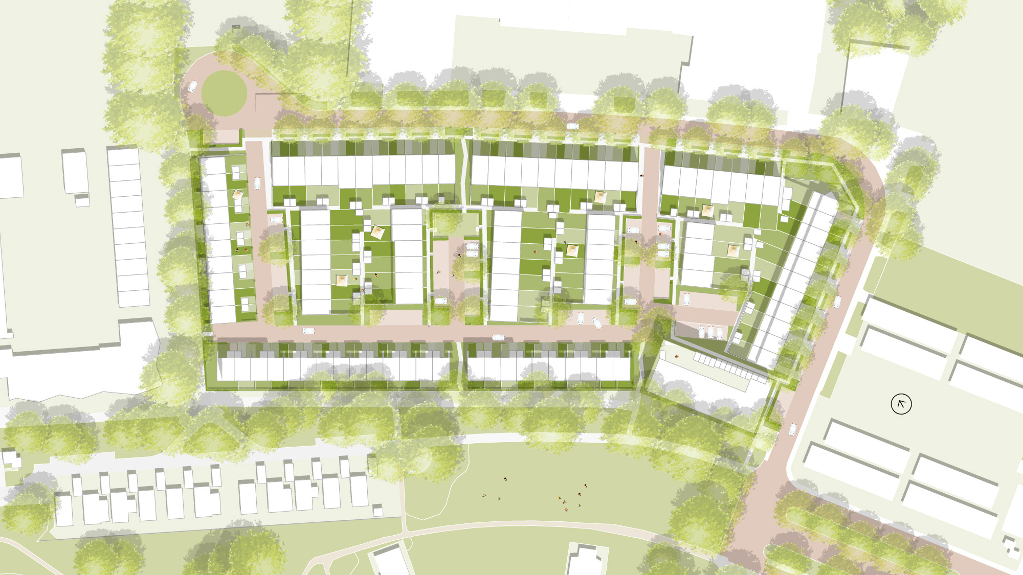
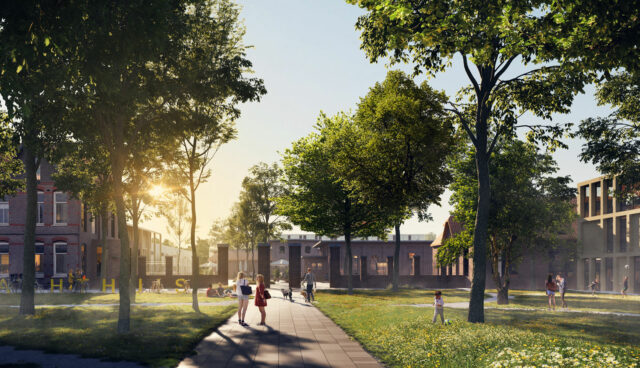
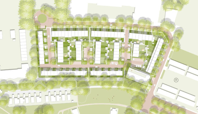
BERLAGEHOF GRONINGENOn the edge of the Korrewijk in Groningen, in a somewhat run-down area, there was an empty school building. How can OZ give the former school area a new (residential) function and improve the quality of the environment? Despite the limited flexibility, the zoning plan still left room for a number of new developments. In addition, the location transformed to an accessible area and was no longer a part of the fringe of the city. The existing urban structure is a design by architect H.P. Berlage and therefore, is a protected cityscape. OZ saw this as a design opportunity. From OZ’s point of view the existing situation of the high architectonic quality had to be justified by the new design. Other aspects had to be taken into account in the urban development design for this location: the surrounding area and this location was impoverished, and the weak connection with the greenery present in the district. In the end, 127 family homes were built in the Berlage-Hof in 2018. In 2019, 24 apartments were added. The RölingCollege was one of three school locations to be redeveloped on the Korrezoom-Antillenstraat. Process supervisor CON-C was asked by the client Ter Steege Vastgoed and the municipality to supervise the design process. CON-C then asked OZ to join. In addition to the municipality and Ter Steege, OZ and CON-C also took part in a workshop at the beginning of 2011. The assignment was analyzed in the workshop and the basic principles regarding urban development, architecture, ecology, traffic and public housing were established. After that, the urban architectural design was completed within a few months. There was no municipality programme, which means that CON-C and Tersteege themselves looked for a suitable programme. Within the urban design, OZ had also taken the initiative for the outline of the architecture. Dedem Architecture as the project architect further elaborated the design. The old and vacant Röling College stood on the site in a forgotten corner of the originally chic Korreweg district. The district was built at the time of an urban expansion plan by the architect Berlage, among others. The district is characterize by the magnificent streets and monumental buildings. The school had a view of buildings on the other side via the Antillen street. The quality of the buildings were mediocre, making the view less pleasant. The development area was adjacent to a large green zone: the Berlage-zone. There was a separation between the park and the future apartments in the form of a row of park dwellings. For a richer green experience, the green zone could be strengthened.
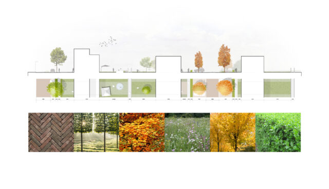
OZ offered an urban development solution in which the green zones were better integrated into the environment and expanded with an eco-zone. The public space is arranged according to shared space. Points of attention were, the alternation between parking and green space, the ability for kids to play safely on the street, and the transition between public and private space. The architecture maintained the historic quality of the district. The strengths of the urban development solution were:
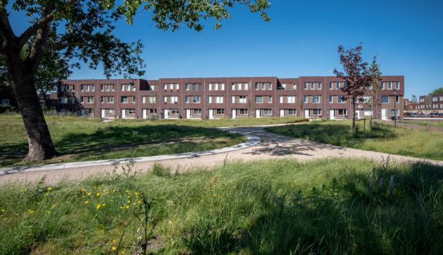
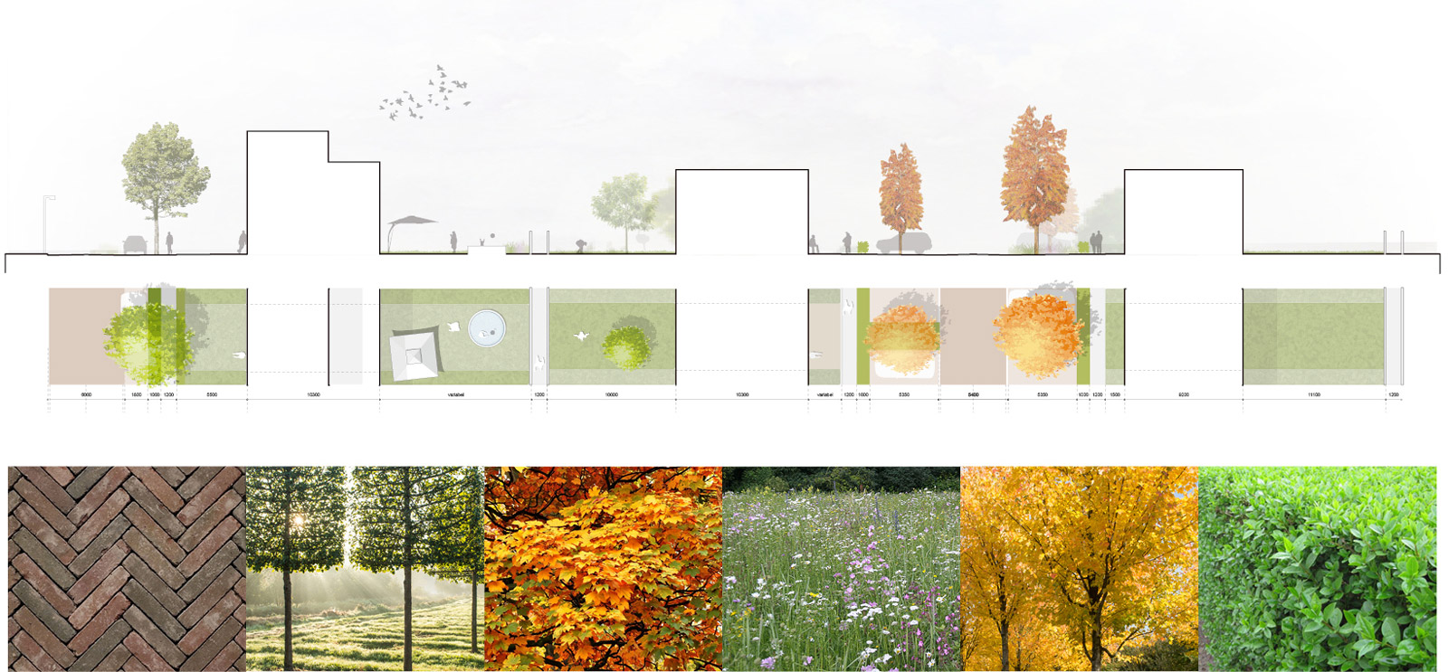
The name Berlage-Hof is a tribute to this influential Dutch architect and urban planner. The architectural style of the houses in Berlage-Hof also refers to the historic architecture of yesteryear: red brick, facade decorations and turrets. What is special is that the single-family homes in Berlage-Hof all have their own garden and parking space on site. Despite the densification, the district still has a lot of space and greenery. There are trees, hedges and other species of plant. The terrace houses have green roofs and the entire plan has made room for birds and bats. Quality living amenities, with acces to green in an urban environment is difficult to find. client: Ter Steege Vastgoed Hardenberg |
|
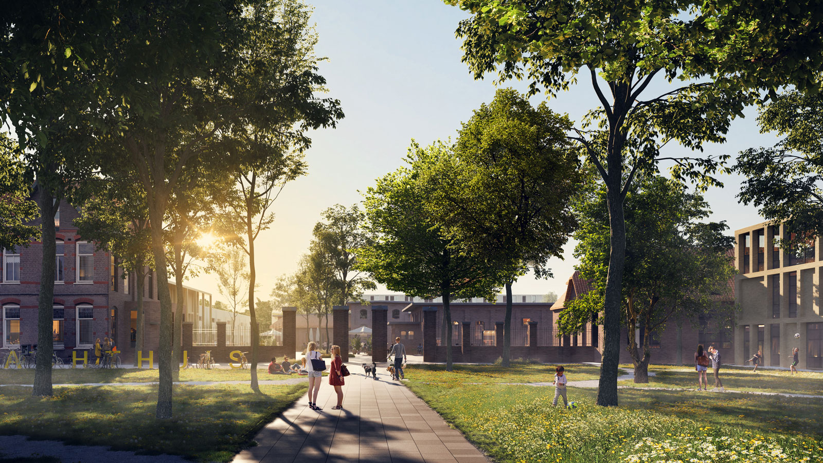
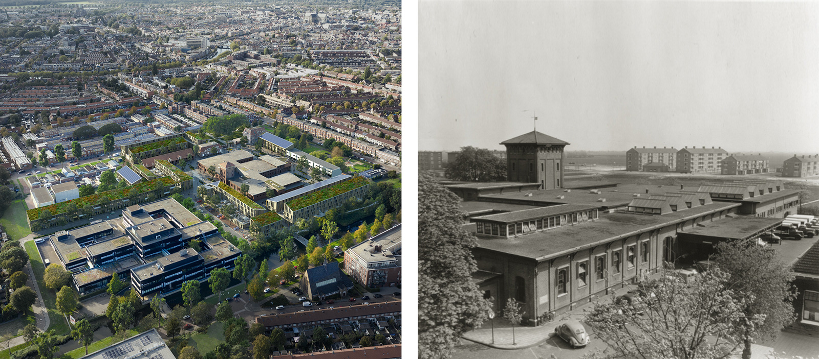
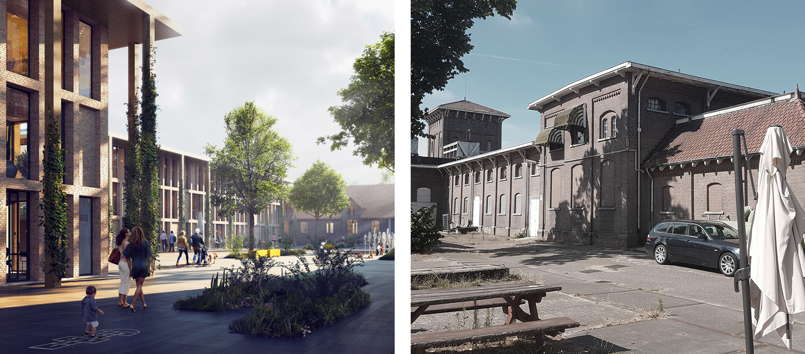
SLACHTHUISTERREIN HAARLEMIn a historic part of Haarlem, the former Slachthuisterrein from 1907 in the district of the same name, developer BPD will transform this location into an iconic part of Haarlem on behalf of the municipality. Part of the plans is a pop music centre, a long-cherished wish among musicians in Haarlem. The challenge here is to connect the site to the environment, because the Slachthuisbuurt was built later than the slaughterhouse itself so it differs in design. The unique appearance of the historic building must be preserved, and in conjunction with the desired 160 new-built homes. And the municipality wants a sustainable project, which is another reason why much of the historic urban development structure is preserved. OZ’s design has reached the final round of the design contest, along with the solutions of three other parties. Because the design has been fully worked out, we are happy to present it here. The design relies on connections: with the environment, between old and new and in the form of meeting places. And we give substance to a healthy living environment with the Healthy urban living concept.
A tough, contrasting and attractive living-working area, that is the vision of the tendering combination of Flux Landscape Architects, Koenders & Partners, W/E Adviseurs and New Horizon. OZ devised a strategy consisting of five elements: Strategy 2: Connecting old and new Strategy 3: Connecting through functions Strategy 4: Fronts everywhere Strategy 5: Healthy urban living client: VORM Ontwikkeling BV |
|
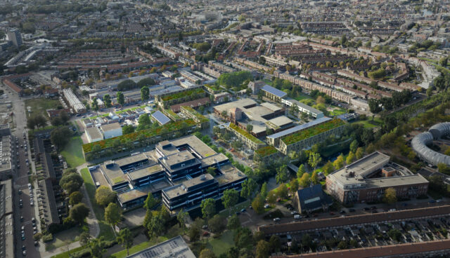
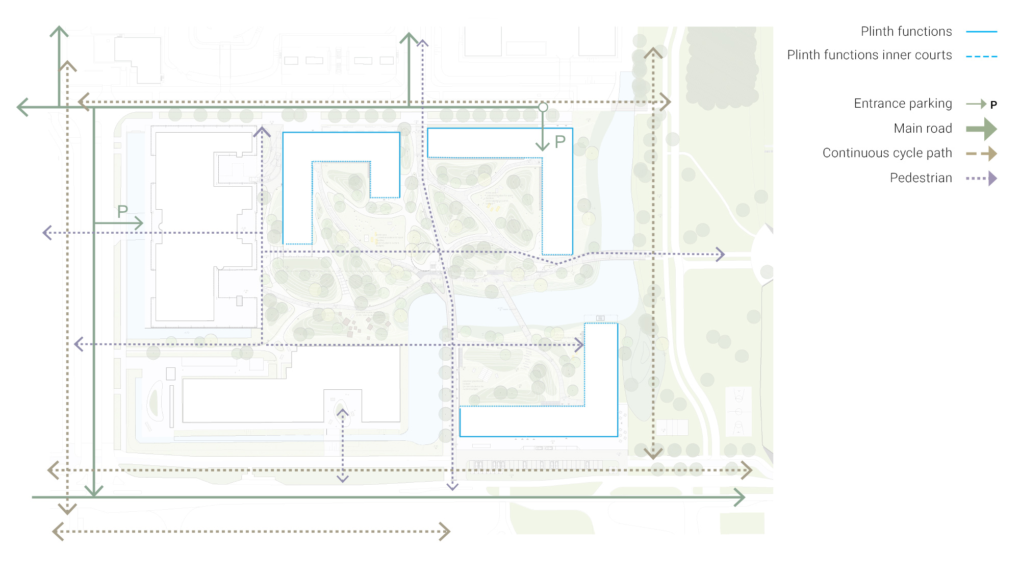
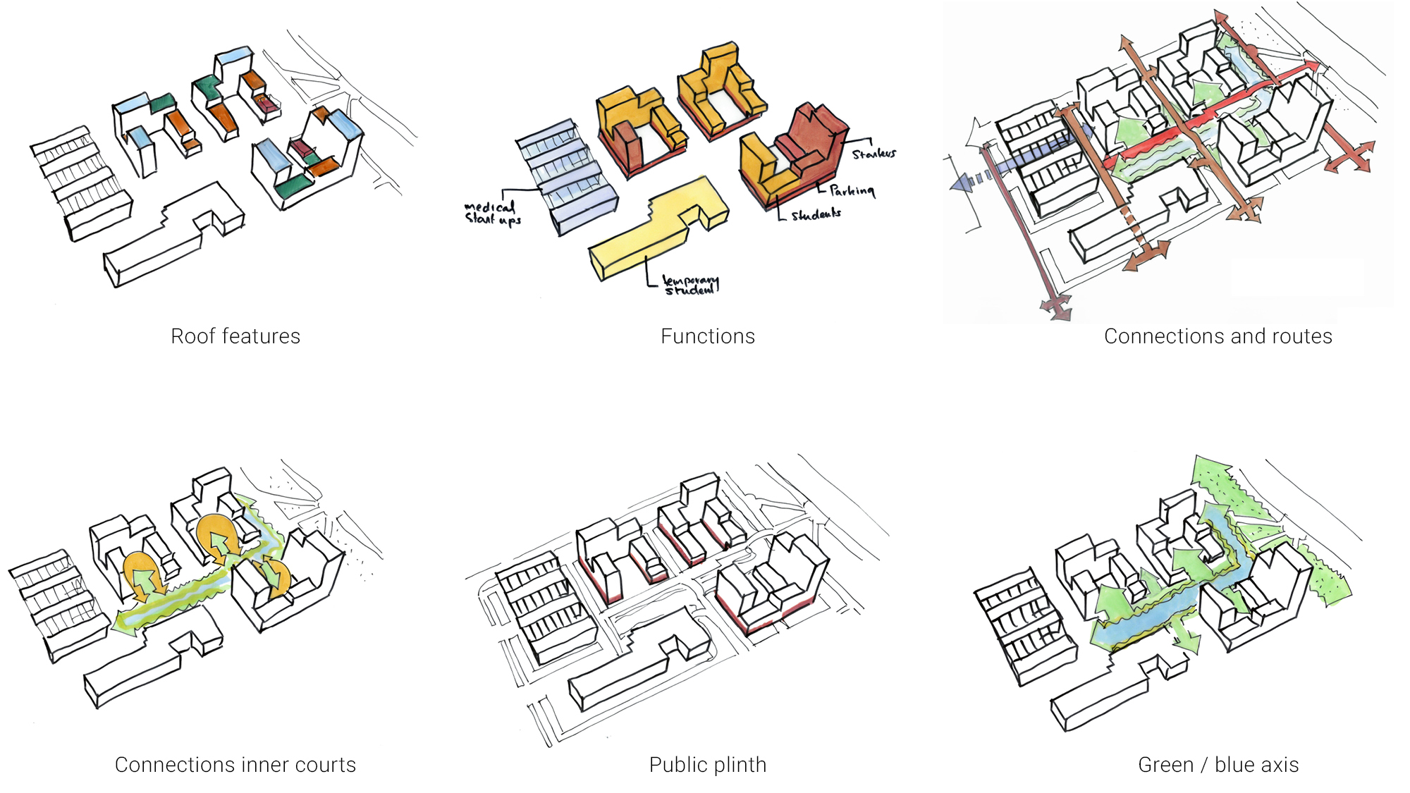
OURDOMAIN AMSTERDAM SOUTHEASTOurDomain Amsterdam Southeast, located on a knowledge axis consisting of educational institutions and student housing in Amsterdam, sparks a new pulse in the area. Strategically located next to an academic hospital and train station, the campus with a critical mass of approx. 1,500 apartments and amenities introduces its first residential building into a predominantly office area. This new campus is the catalyst that ignites the long desired change from a mono-functional office area into a lively, multifunctional city district. The urbanistic objective of the OurDomain campus is to introduce fundamental change, generate new connections, and facilitate social space that inspires its users. All stakeholders considered the surrounding larger transformation area (known as Amstel III) problematic. The location, set up as an office area, has an unattractive appearance. A hospital is one of the main stakeholders in the area. Social safety is a point of attention. The big question was: how to unite this divided area in such a way that it becomes a whole? With the plan for the OurDomain campus, a connection was realized as a first step for the further development of the transformation of the area as a whole. The choice for a campus community at this location is special, because it is the first time that people can live in this part of Amsterdam. The idea to implement a campus relates to a current Amsterdam housing issue: a great shortage of housing for students and young people. In order to make this residential function possible the municipality of Amsterdam amended the zoning plan in 2011 to permit residential units, at the request of market parties. In 2014 OZ, together with consultant Fakton, developer Blauwhoed, real estate owner LSI and investor Greystar, researched the possibility of introducing a large quantity of apartments. It was investigated whether a new campus for young adults next to the hospital responded to the demand for more youth housing. The results were positive and that is how the fundamental plan for an area-oriented approach was born. A new tenant for an empty office building and parking garage on the location of OurDomain could not be found and the area was socially unsafe. For these reasons, it was decided to demolish both buildings. The main urban development objective for the area was to connect functions, routes, and surroundings to the campus. The public space, at first an unattractive place to stay, was the basis for the campus plan. The layout of the public space ensured cohesion in the plan area, the community campus and the medical campus as a whole. A high-quality public area was essential, because of the residential function of the community campus.
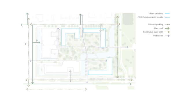
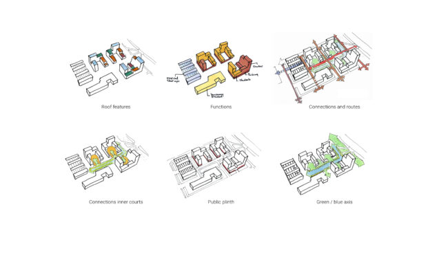
The architecture strengthens the relationship with the public space. The connection of the outdoor space to the ground level of the three buildings is very important to create one community. Openness is a key word that is reflected throughout the campus. Water and greenery no longer act as dividing elements, but were transformed into connections. The cycling and running routes are more integrated than before. Continuous routes connect the campus with the metro station, hospital and other surrounding buildings. The routes in the plan are connected to squares, which have various functions and activities. Residents meet here, play sports or organize a BBQ. The public functions located in the plinth are meant for the residents of the community campus. Inserting three large housing blocks (East House, North House and West House) around an articulated park allows for a recognizable residential atmosphere in a predominantly office location. The three blocks, each with an independent identity, are designed to be cornerstones that mark the park boundary. Together with the two existing buildings, which will be transformed into student housing and medical startups, the campus will grow into the pivotal center of the area. The lush, inviting landscape design by Karres en Brands adds articulated topography to the park. The residual soil of excavating the underground parking garage is used to make small-scale hills that render local quality, give the area a strong identity and inspire people to make use of it. client: Blauwhoed |

