Endemol / studios and office
Amsterdam Zuid-Oost
Endemol / studios and office
Amsterdam Zuid-Oost
The area around the Arena boulevard in Amsterdam Zuidoost has quickly developed into a high quality entertainment centre. We complemented this area by the Endemol Nederland studio complex. Following a competition between combinations of developers and architects, OZ together with G&S Vastgoed B.V., were commissioned to construct this complex.
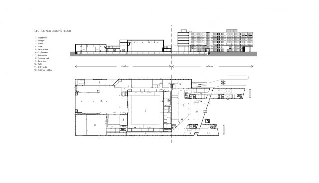
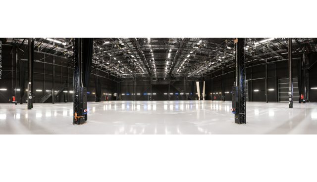
In addition to studios, décor ateliers and catering facilities, the complex also includes offices. The client also wanted a building that is in line with market requirements and completely attuned to running the 24-hour company of Endemol in the most efficient way. With this in mind, it has to be possible to quickly rebuild studios, effortlessly change the décor and efficiently manage flows of visitors. In short, it has to be possible for the company to operate as a well-oiled logistical machine. The building had to fulfill two contradictory requirements. On one hand it had to be unique, distinctive and express the feeling of entertainment. On the other hand, the building had to have an underlying structure that is neutral. This allows people to adapt the building easily for future purposes; which might even include a different function.
A waterside entrance square
The urban development plan of the Municipality of Amsterdam devised the ‘Trading House Location’ as two parallel strips. This offered a wide variety of individual office buildings as well as hotels, interspersed with large-scale business premises. Between De Loper, De Passage, De Holterbergweg and sports fields you’ll find the rectangular building plot. The concept for the Endemol complex combines all the intended business units in one building, which accounts for a large part of the plot.
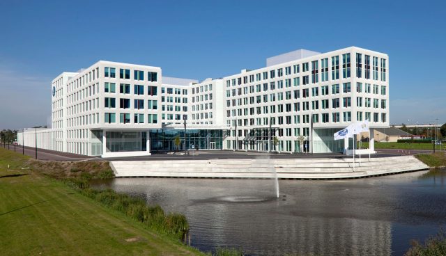
The first two storeys form a basis for additional volumes. On the boulevard side (De Loper), the storeys take the form of a U shape which is 6 and 7 layers high. This storey is furnished as office space. The ground floor and the first floor include rooms for studio activities and public functions. The U shape opens up into De Loper and provides access to the entrance square. The entrance square borders an attractive water garden with fountains, providing both a natural and festive feel.
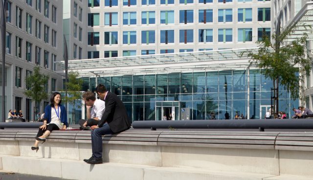
We created the water garden by widening the existing narrow watercourse alongside De Loper, which lies close to the plot. The banks form a gradual, terrace-like transition from the entrance square to the water with an elegant fan of plateaus on which the public or personnel can ‘lounge’. Together with the water, the plateaus form a ‘water square’. A series of attractive urban spaces that extend from the water square to the entrance square greet the entering people. After the physical entrance, the spatial series continue automatically in the form of an inner court, referred to as the atrium.
Dynamic atrium Endemol
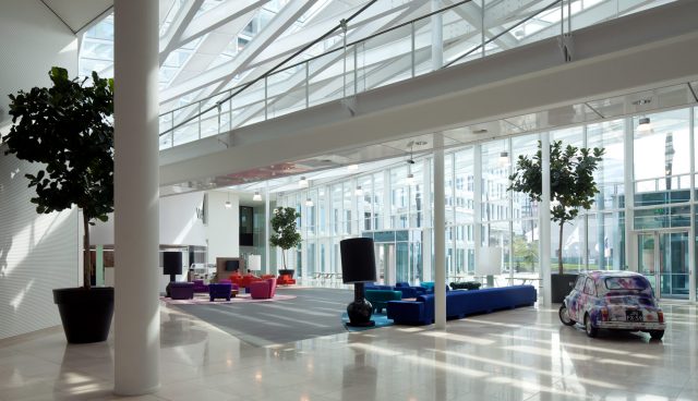
The entrance of the Endemol building leads into an impressive and dynamic multifunctional atrium. Firstly, the various public and employee flows meet. Later, they are divided. The true theatrical nature of the building comes to life in the atrium. The studio part behind the atrium has both a large and a small studio that extend like ‘giant skylights’ above the two-storey basis. Endemol selected the design by OZ because of its efficient, logistical layout; the practical usefulness of the spaces; and its considerable flexibility.
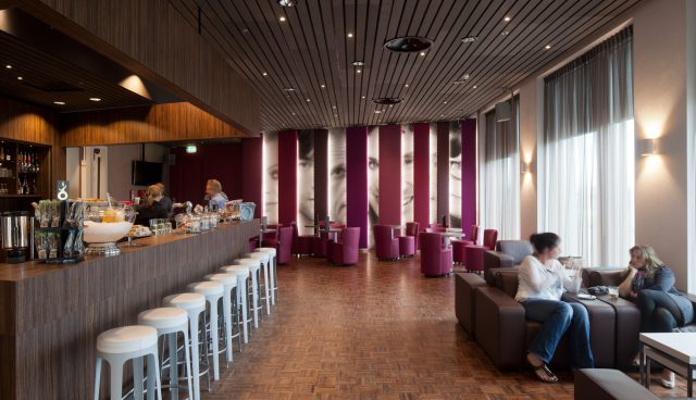
We regarded the inclusion of the atrium as very valuable. The atrium wasn’t featured in the schedule of requirements but did however add a large number of possible uses. Not only do the practical qualities of the atrium give the building substantial added value, but so does its spatial quality. The atrium acts as a central meeting square. Here, you can link various spaces. We did this to form one large entertainment landscape. In the atrium you’ll also find the restaurant and the artists’ café. In the event of private get-togethers or smaller events, it is possible to separate these spaces from the atrium. We lowered the atrium roof where the atrium meets the first floor of the building. This creates patio areas, which infuses the offices with light and serves as a terrace.
Sober on the outside, festive on the inside
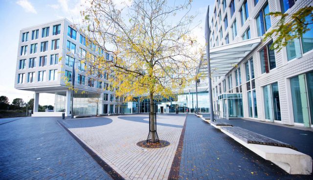
A façade structure of light-coloured concrete based on a square lattice of window openings (2.70 m x 2.70 m) gives the building its universal, peaceful image. Giving the concrete a relief structure accentuates the material’s natural, rough character. A combination of the tight contours of the building mass and the consistently applied façade pattern give the building a clear identity. The building’s light-coloured concrete sets the building off against the darker masses of the buildings in the vicinity. We brought the neutral concrete pattern to life by the colour accents via the coloured vertical panels at the location of the opening windows. Harmonising tints form a diagonal pattern across the façade surface. Anyone who walks or drives past the building experiences a repeatedly changing play of colours.
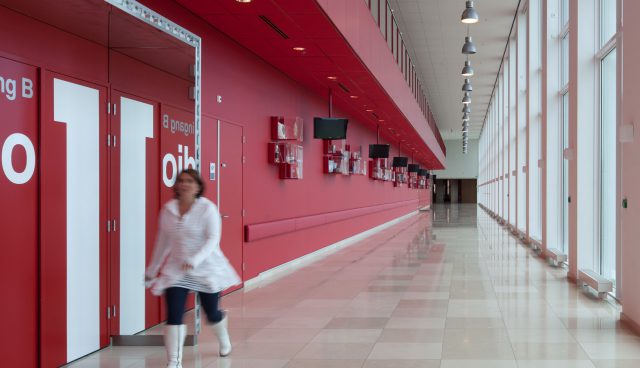
In contrast to its overall peaceful appearance, the dynamism of the activities taking place in the building pervades the ground floor, the entrance square, the atrium and the foyer. In the evenings, the building undergoes a transformation in form from introverted to expressive. The studios’ skylights illuminate the building like party lights. The atrium is also lit up in the facade. The dynamic movements of people are clearly visible behind the glass facades. In contrast to the sober outside, the atmosphere in the interior is festive, colourful and warm due to, the application of wood. Atrium-high dividing walls mean that the space can be divided up and closed off in a variety of ways. The interior concept and the entire layout of the building are the work of the interior department at OZ; in cooperation with Studio Linse Amsterdam.
Read more about the makers located in Endemol here.

